
In this post, you'll learn how to create a basic password generator using Base Web components. If you are unfamiliar with Base Web, please go over the Getting started section before continuing with this article.
Setup
For the sake of simplicity, we'll use create-react-app to bootstrap a React application.
create-react-app password-generatorcd password-generator
Next, we need to pull in the packages for Base Web.
yarn add baseui styletron-engine-atomic styletron-react
You might be asking "What's Styletron?". Styletron is a CSS-in-JS solution for component-oriented styling.
As per Base Web's set up instructions, we need to wrap our app in both the Styletron Provider and the Base Provider before we can begin:
import {Provider as StyletronProvider} from 'styletron-react';import {Client as Styletron} from 'styletron-engine-atomic';import {LightTheme, BaseProvider} from 'baseui';const engine = new Styletron();ReactDOM.render(<StyletronProvider value={engine}><BaseProvider theme={LightTheme}><App /></BaseProvider></StyletronProvider>,document.getElementById('root'),);
Do you want to learn more about Styletron? Check out the Styletron docs.
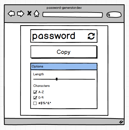
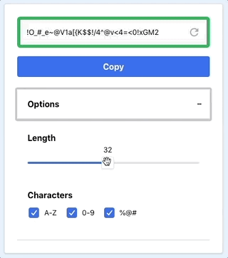
What are we building?
In this post, we'll implement the following mini-app, that can be used to generate passwords. It will look something like this:
We can create the majority of our UI using the following components
This puts us in a good spot without needing to make any changes.
At this stage, we can hook up some logic and we are almost there. It's not pretty though. We need to add some of our own styling tweaks.
Overrides
If you've ever consumed component libraries, you've likely hit some hurdles. You may want to pass extra props or tweak the rendering. The common scenario is wanting to adjust styles. Some libraries cater for this by exposing extra verbose props.
<MyAwesomeComponentcallToActionsStyle={...}onActionClick={...}containerStyle={...}style={...}/>
Base Web tackles this with an "Overrides" pattern. It provides a consistent API to override a components characteristics. You are able to override the styles, props and render logic of a component. And this is all made possible through one prop.
To learn more, check out the Overrides guide.
Don't throw everything into overrides though. Adjusting your theme values is better if you override the same properties over and over (Read about themes here).
To customize the Card component to work better for our use-case, we can do something like this:
<Cardoverrides={{Root: {style: {left: '50%',maxWidth: '420px',position: 'absolute',top: '20px',transform: 'translate(-50%, 0)',width: '95vw',},},}}>...</Card>
As a next step, let's move the button inside our input that generates a new password every time a user clicks it. We could use the Button component and tweak the positioning. But there is no need. Base Web already caters for scenarios like this:
<Inputoverrides={{After: () => (<Button kind={KIND.minimal}><Icon /></Button>),}}/>
Using overrides, we can leverage an After option and pass a Button to it.
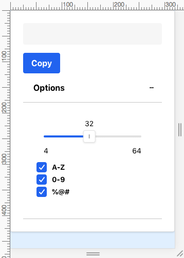
Adjusting the layout
Our app looks almost there but the layout for those options doesn't look right. We need some labels and layout constraints. Base Web provides a component that aids with creating these less reusable layout pieces. We can use a Block whenever there's a need to layout UI.
<Block marginBottom="scale800"><FormControl label="Length"><Slider {...sliderProps} /></FormControl></Block>
Alternatively, you can use the useStyletron hook to achive the same result:
const [useCss, theme] = useStyletron();<div className={useCss({marginBottom: theme.sizing.scale800})}><FormControl label="Length"><Slider {...sliderProps} /></FormControl></div>;
Hooking up the password generation
Let's hook up the logic for our password generator. We will use zxcvbn and generate-password to handle validation and generation.
Base Web exposes the props we need for various change and click handlers. Except for copying our password to clipboard, interactions will generate a new password.
const setNewPassword = p => {const newPassword = p? p: generatePassword({length, numbers, uppercase, symbols});const {score} = zxcvbn(newPassword);setStrength(score);setCopied(false);setPassword(newPassword);};
We generate a new password inside an effect whenever one of our options changes. We also generate a new password when our Input action gets clicked.
Communicating password strength
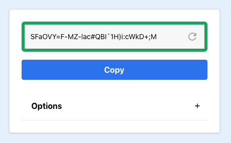
One thing we aren't doing yet is communicating how strong a generated password is. We have a strength score but we aren't using it. Let's communicate password strength with a thick colored border on our input.
We can pass our strength score into a function that returns a color ID from our theme.
const getStrengthColor = strength => {switch (strength) {case 0:return 'negative400';case 1:return 'warning400';case 2:return 'rating400';case 3:return 'positive200';case 4:return 'positive400';default:return 'primary50';}};
Tie that into our Input:
<InputinputRef={passwordRef}value={password}onChange={event => setNewPassword(event.target.value)}overrides={{InputContainer: {style: ({ $theme }) => ({borderColor: $theme.colors[getStrengthColor(strength)],borderWidth: $theme.sizing.scale200})},After: () => (...)}}/>
And this will give us
Conclusion
With little effort we've put together an example app that uses the Base design language.
By default all the components have the Uber look and feel, but the powerful customization makes for a component library that feels less opinionated.
You can see all the code for this post in the following demo: