Building an International Phone Input
A new component exhibits the flexibility of Base WebIn Base Web v7, we introduced a new component: the Phone Input. This post offers a peek behind the curtains, to see what goes into the design & implementation of a new design system component.
The setup
A number of projects at Uber require collecting a user’s phone number. To date, each project at Uber has had to implement their own unique solution for collecting this information. Over time, inconsistencies pop up across our products as each one utilizes a slightly different design.
The Base Web team saw an opportunity to save developers time and improve product consistency by providing a drop-in component tailored to collecting phone numbers.
Design thoughts
What is the ideal user experience for entering your phone number?
A sequence of digits
First we should clarify what we mean by “phone number”. It might seem obvious, but there is actually a fairly convoluted system behind the global organization of phone numbers.
The main source of complexity is that the sequence of digits you enter to reach someone over the phone depends on where you are and where the recipient of the call is. A phone number that works locally might not work in a different region let alone another country. The most common example of this is when you travel to another country and you can no longer contact folks with the same sequence of digits.
Thankfully, the E.164 international phone number formatting standard exists. The promise of E.164 is that any telephone number following the spec, regardless of location, can be uniquely identified and reached from anywhere else in the world (assuming you have reception).
The two distinguishing elements of the E.164 formatting are the country code (preceded by a +) and the national digits (up to 15 digits).
This is the information we want to collect when we ask for a user’s phone number.
The experience
Let’s refine our original prompt: What is the ideal experience for entering your E.164 formatted phone number?

If you believe that the best interface is no interface then we should take advantage of the browser’s autocomplete.
We simply need to include autocomplete="tel" and if the input is set up properly in a form, we can avoid the user having to even think about our phone input.
The only issue here is that what the browser autofills might not include the country dial code.
If the user has entered their phone number for a local or country specific form in the past, the browser may have that value saved for all autocomplete="tel" phone inputs.
We need to ensure we collect the phone number in an E.164 compliant way.
Validation & formatting
There are a number of ways to verify a user’s phone number on the frontend.
Google has a massive library for formatting, parsing and validating international telephone numbers. But it doesnʼt seem worth shipping half a megabyte of logic for an input that might occur only once in an app.
We could use a lighter approach and pass a pattern regex to our input element, but there are a couple issues with this strategy.
For one, most React apps donʼt use built in browser validation, so it probably isnʼt terribly useful.
Perhaps of more importance, there are dozens of ways to format phone numbers based on local conventions. When researching for this project, I wasnʼt able to find a single regex that could validate every variation of phone number formatting. This means we would need the user to format their number according to our regex.
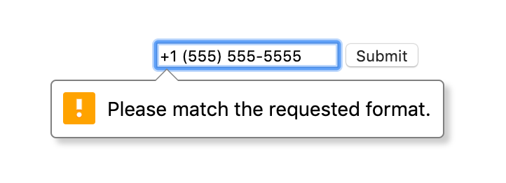
I think we can agree that this is a bit obtrusive.
Ideally, the user can enter their phone number in whatever way makes sense to them.
If a user wants to enter their phone number as (555) 555-5555 or 5555555555 it should not matter.
As much as possible, we should do validation and sanitation on the backend (since we need to regardless) and be liberal with what we accept on the frontend.
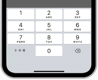
To help the user enter their number more naturally we can also add the type="tel" attribute to our input.
On some browsers, mostly mobile ones, this attribute tells the OS to use a unique keyboard matching the context of the input.
In our case it brings up a keyboard specific to phone numbers.
That’s nice. But there is still a crucial piece missing from our design.
The + bit
We want to indicate to the user that the E.164 country dial code is required. Once again we have a number of ways to accomplish this, but they boil down to two main approaches.
- Prompt user to include country code and validate input.
- Separate country code and national digit sequences into two different inputs.
While the first design is elegant in the sense that it has only one input to fill out, it can get a bit clunky to describe to the user what is required. You can use placeholder text to indicate that the country code is required or even include a small hint somewhere adjacent, but it requires the user parsing and translating this before attempting to fill out the input.
We went with the second option because it is less ambiguous. It seems simpler to have an obvious first step (select your country code) rather than ask you to type out your country dial code in our format (assuming you already know it). With the second approach, you can just fill out your phone number as you normally would.
Another advantage to isolating the country code: it is much easier to validate a telephone number on the backend if you already have the country code. This in turn lets us be more liberal with the formatting we accept for the national digits input. Some folks call that “synergy”.
And finally, having the inputs be more explicit let’s us guarantee a better accessibility experience. If we have an input that is doing auto-formatting or throwing errors it can be confusing to those using a screen-reader. The app using our component needs to be very intentional about how they direct focus and alert the user of errors. While it isnʼt impossible, it is much simpler and safer for us to have two inputs that are very clear about the values they are collecting. It requires less reliance on the app developer getting the experience right.
Flags
This leaves us with a subset of our original design prompt: What is the best way to choose a country code?
We can greatly reduce the chances a user needs to select a country code by getting the initial value right. We can do this during a localization step in our appʼs build process or more accurately in real time by looking at a userʼs IP. You can find what country a user is visiting from by making an async call to an IP lookup service or, if you have one, your own backend service. Once you know the country, you can pre-select the closest matching dial code and the majority of users will not have to worry about it. Now, even with this optimization, we still need a back up method for users to choose their country code.
Many users probably know their country code already but it is understandable if a large set of users do not. In this case the most intuitive (and most common) approach is to have the user choose from a mapping of country names to dial codes. We can also provide small flag icons next to the country names for quick visual scanning.
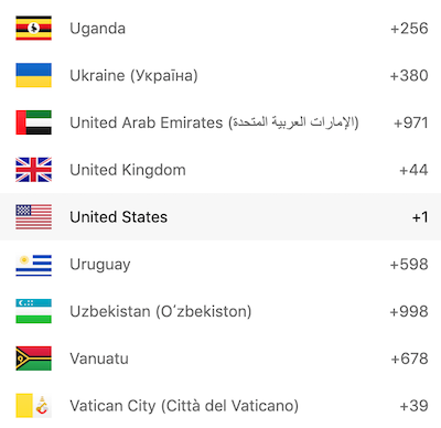
This is where the current Phone Input design stands, but you may notice a potential issue with this design. There are almost 300 country codes to choose from. That can lead to a lot of scrolling if, for example, a user has an Argentinean phone number but the dropdown has the United States pre-selected. In a future version of the Phone Input we should add a way to alleviate this potential inconvenience.
Typing in your country name should quickly filter the list down to something more manageable.
Sometimes country names can vary slightly so it would be helpful to use fuzzy filtering for our list rather than following the default browser select filtering behavior.
This means a user can open the dropdown, type tobago and quickly select Trinidad and Tobago.
This would function similarly to Base Web’s default Select, which has fuzzy filtering and keyboard accessibility built in, but we would need to integrate it into the Phone Inputʼs design.
Implementation
The Phone Input is a great example of the flexibility of the override system. We can create an entirely new component by composing two of our most basic components:
The Input:
And the Select:
Input has two very handy overrides: Before and After.
These allow you to place anything you want at the beginning or end the input.
const inputOverrides = {Before: {component: () => `🐨`,},};
There is no reason we canʼt put our Select in there too!
const inputOverrides = {Before: {component: Select,},};
You can already see the shape of the Phone Input emerging and, truth be told, there is not a whole lot more required for the actual implementation.
Most of the other code required is for styling and configuring the dropdown.
The default dropdown has some latency issues when rendering 300 country flags so we override it with an virtualized dropdown.
We use the react-virtualized library to only render a necessary subset of the countries in the dropdown (based on scroll position).
This results in a buttery smooth dropdown.
If youʼre curious, it shouldnʼt take too long to read through the source code—perhaps with a nice cup of tea.
In conclusion
The addition of a component like the Phone Input is a bit of a first for Base Web. We have generally offered highly reusable components, ones that can be composed and customized to build any sort of web app. The Phone Input is a bit of a conceptual departure from this model. As a component, it focuses on handling a very specific use case: collecting international phone numbers.
While the Phone Input can still be completely customized, it is unlikely to be composed with or used to build a new component. Instead, the Phone Input makes use of more atomic components, such as the Input and Select, in combination with Base Web’s override pattern, to create a “higher-level component”. Ideally, it can be dropped in to your project, hooked up with minimal work, and solve a small portion of your product’s design.
Base Web has reached a state where most of the building blocks exist. With the addition of a component such as the Phone Input (and the slick new Payment Card), we are expanding the scope of Base Web to include higher-level design patterns.
Expect to see more of these sorts of compositions in the future. We are asserting that a design system can do more than save developer’s time-it can help enforce consistency across a product’s user experience and improve the product’s quality while doing so.