Building Responsive Apps with Base Web
Tips and tricks for building responsive apps for mobile and desktop using Base Web
When building web applications, it is important to consider all users and prioritize accessibility. More and more people are relying on their phones to access the web, which means we need to ensure our applications work well on smaller form factors. Here are some tips and tricks for using Base Web to build UIs for both mobile and desktop.
Setting the viewport meta tag
Before we begin, we should set the viewport meta tag.
The default browser behavior is to shrink the page until the entire width of the page is visible, forcing the user to pan and zoom on smaller devices. This behavior, however, is undesirable once you build a responsive app, and wish to see the content at its intended scale. In order properly size the content based on the device width, you will need to set the viewport <meta> in your <head> (or <Helmet>)
<head> // or <Helmet><metaname="viewport"content="width=device-width, initial-scale=1, shrink-to-fit=no"/></head>
This meta tag was originally introduced by Apple for iOS Safari, but has since become an industry standard for controlling the viewport’s size and scale.
width=device-widthsets the width of the page equal to the width of the device or window. E.g. if your screen has a width of 375px, thenwidth: 100%will set the width to 375px.initial-scale=1tells the browser to start at the 1:1 zoom level.shrink-to-fit=nofurther prevents the page from scaling down in the event that you have elements on the page that overflow (either intentionally or unintentionally) the viewport bounds.
Custom breakpoints
In many cases, you would want to override Base Web’s breakpoints with your own. The default breakpoints for Base Web are:
small: 320medium: 600large: 1280
To override these, we recommend creating your own mapping, as well as generating the respective min-width media query strings using getMediaQuery() (v6.19.0+), so we could target different screen widths for styling:
const MyBreakpoints = {small: 769,medium: 1024,large: 1216,};const ResponsiveTheme = Object.keys(MyBreakpoints).reduce((acc, key) => {acc.breakpoints[key] = MyBreakpoints[key];acc.media[key] = getMediaQuery({'min-width': `${MyBreakpoints[key]}px`,});return acc;},{breakpoints: {},media: {},},);export const MyTheme = {...LightTheme,...ResponsiveTheme,};
This sets the following values inside MyTheme:
{"breakpoints": {"small": 769"medium": 1024,"large": 1216,},"media": {"small": "@media screen and (min-width: 769px)""medium": "@media screen and (min-width: 1024px)","large": "@media screen and (min-width: 1216px)",}}
Then you can use MyTheme throughout your app using Base Web’s ThemeProvider.
Mobile-first styling of components
It is important to write your styles mobile first by default, and to treat desktop styles as enhancements. This is because it is usually easier to scale up a mobile component for desktop than vice-versa; desktop components often have usability issues when shrunken down.
Another benefit with this approach is the consistency with how Base Web components handle responsive props, which we will see later on with the Block and FlexGrid components.
Now that our theme is set up with media queries, we can start using them to create responsively-styled components using themeStyled():
const LoadStatus = themedStyled('span', ({$theme}) => ({...$theme.typography.font350,color: $theme.colors.mono800,[$theme.media.small]: {...$theme.typography.font500,color: $theme.colors.mono900,},}));
With our small breakpoint of 769px, this means that the component will change font-size and color as the screen increases past 769px:
Block responsive API
The Block component accepts props either as a single value or an array of values. When an array is used, it will generate media queries based on the current theme breakpoints.
This gives us a simpler way of creating components:
const NavBar = props => (<Blockheight={['scale1400', 'scale1600']}paddingLeft={['scale800', 'scale1200']}paddingRight={['scale800', 'scale1200']}{...props}/>);// is equivalent toconst NavBar = themedStyled('div', ({$theme}) => ({height: $theme.sizing.scale1400,paddingRight: $theme.sizing.scale800,paddingLeft: $theme.sizing.scale800,[$theme.media.small]: {height: $theme.sizing.scale1600,paddingRight: $theme.sizing.scale1200,paddingLeft: $theme.sizing.scale1200,},}));
Mobile-only or desktop-only Blocks
We can also take advantage of these responsive properties to completely hide a Block component using CSS display: none.
// TabLink appears only on mobileconst TabLink = props => <Block display={['block', 'none']} {...props} />;// NavLink appears only on desktopconst NavLink = props => <Block display={['none', 'block']} {...props} />;
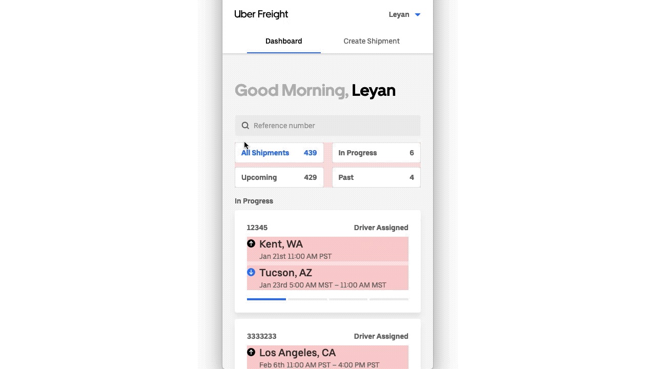
FlexGrid component
Another handy tool for building responsive UIs is the FlexGrid component (v6.19.0+). This component lets you build grid layouts using CSS flexbox, supporting Internet Explorer 10+ users. It sets gaps between the columns and rows using :nth-child and :nth-last-child math, which avoids extra margins at the end of each row or column, and also adds extra margins to account for incomplete rows. FlexGrid also allows for responsive prop arrays like the Block component.
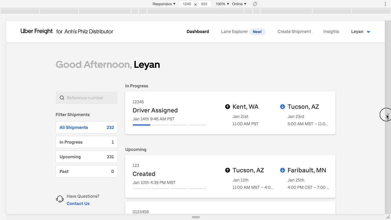
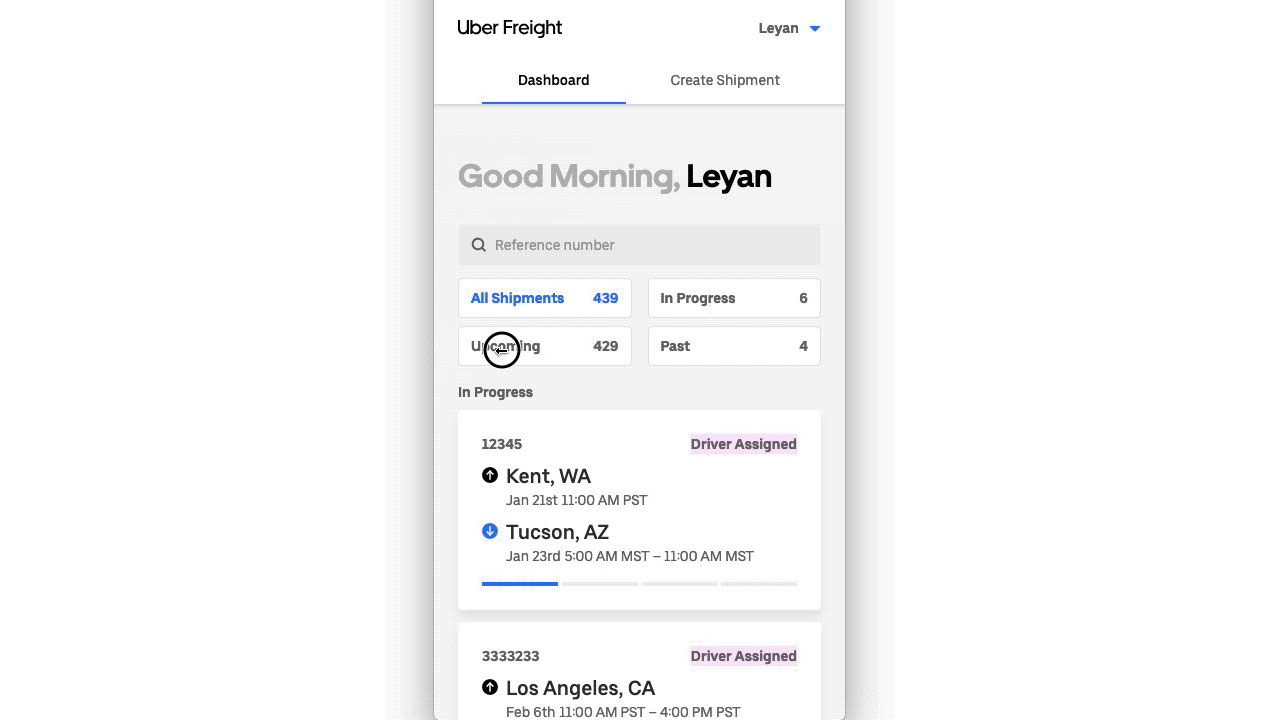
// Example usageconst Filters = () => (<FlexGrid columnCount={[2, 1]} columnGap="scale300" rowGap="scale800"><FlexGridItem>All Shipments</FlexGridItem><FlexGridItem>In Progress</FlexGridItem><FlexGridItem>Upcoming</FlexGridItem><FlexGridItem>Past</FlexGridItem></FlexGrid>);const Locations = ({Pickup, Dropoff}) => (<FlexGrid columnCount={[1, 2]} columnGap="scale300" rowGap="scale300"><FlexGridItem><Pickup /></FlexGridItem><FlexGridItem><Dropoff /></FlexGridItem></FlexGrid>);
These columnCount props mean that the Filters component will have two columns on mobile, and one column on desktop, whereas the Locations component will have one column on mobile, and two columns on desktop:
AspectRatioBox component
On slower network connections, especially apparent on cellular networks, images can cause content to jump around (reflow) as they are downloaded. When browsers see an image tag, they typically do not know how much space to allocate until it begins downloading the image headers, which can take some time.
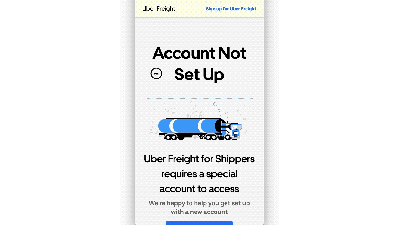
In order to avoid these reflows, we can take advantage of the AspectRatioBox component (v7.5.0+), which allows us to specify the aspect ratio for an element ahead of time using CSS (see CSS-Tricks for how this works).
// Example usage<AspectRatioBox aspectRatio={300 / 117}><AspectRatioBoxBodyas="img"src={assetUrl('/static/error-image.svg')}alt="Truck with scuba-gear on ocean floor with octopus andfishes behind it"/></AspectRatioBox>
Final thoughts
Base Web currently gives you a few foundational components to build responsive web applications: from Block, to FlexGrid, to AspectRatioBox. We hope these components, along with this guide, will help and encourage you to build applications that are accessible to as many users as possible. Base Web is also open-source, so if you want to contribute enhancements or additional components, please check out our contributing guide!